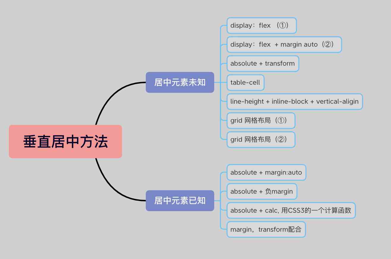
垂直居中主要分为了两种类型:居中元素宽高已知 和 居中元素宽高未知
以下的方法都围绕着该HTML展开
1
2
3
| <div class="wrap">
<div class="box">123</div>
</div>
|
一、居中元素宽高元素未知
1、(常用):display:flex (①)
1
2
3
4
5
6
7
8
9
10
11
12
13
| .wrap{
width:300px;
height:300px;
border: 1px solid red;
display:flex;
justify-content:center;
align-items:center;
}
.box{
}
|
2、常用):display:flex + margin auto(②)
1
2
3
4
5
6
7
8
9
10
11
12
| .wrap{
width:300px;
height:300px;
border: 1px solid red;
display:flex;
}
.box{
margin: auto;
}
|
1
2
3
4
5
6
7
8
9
10
11
12
13
14
| .wrap {
width: 300px;
height: 300px;
position: relative;
background-color: plum;
}
.box {
position: absolute;
left: 50%;
top: 50%;
transform: translate(-50%,-50%);
}
|
4、table-cell
1
2
3
4
5
6
7
8
9
10
11
12
13
14
| .wrap{
width: 300px;
height: 300px;
border: 1px solid red;
display: table-cell;
text-align: center;
vertical-align: middle;
}
.box{
display: inline-block;
}
|
5、line-height + inline-block + vertical-aligin
1
2
3
4
5
6
7
8
9
10
11
12
13
14
15
16
17
18
19
20
|
.wrap {
width: 300px;
height: 300px;
background-color: pink;
text-align: center;
line-height: 300px;
}
.box {
display: inline-block;
vertical-align: middle;
line-height: initial;
}
|
1
2
3
4
5
6
7
8
9
10
11
12
13
| .wrap {
width: 300px;
height: 300px;
background-color: plum;
display: grid;
align-items: center;
justify-content: center;
}
.box {
}
|
7、grid 网格布局(②)
1
2
3
4
5
6
7
8
9
10
11
12
| .wrap {
width: 300px;
height: 300px;
background-color: plum;
display: grid;
}
.box {
align-self: center;
justify-self: center;
}
|
二、居中元素宽高元素已知
1、absolute + margin:auto
1
2
3
4
5
6
7
8
9
10
11
12
13
14
15
16
17
18
19
| .wrap{
width: 300px;
height: 300px;
position: relative;
background-color: plum;
}
.box{
width: 100px;
height: 100px;
background-color: powderblue;
position: absolute;
left: 0;
top: 0;
bottom:0;
right:0;
margin:auto;
}
|
2、absolute + 负margin
1
2
3
4
5
6
7
8
9
10
11
12
13
14
15
16
17
18
19
| .wrap{
width: 300px;
height: 300px;
position: relative;
background-color: plum;
}
.box{
width: 100px;
height: 100px;
background-color: powderblue;
position: absolute;
left: 50%;
top: 50%;
margin-left: -50px;
margin-top: -50px;
}
|
3、absolute + calc, 用CSS3的一个计算函数来进行计算,方法与上面类似
1
2
3
4
5
6
7
8
9
10
11
12
13
14
15
16
17
| .wrap{
width: 300px;
height: 300px;
position: relative;
background-color: plum;
}
.box{
width: 100px;
height: 100px;
background-color: powderblue;
position: absolute;
top: calc(50% - 50px);
left: calc(50% - 50px);
}
|
1
2
3
4
5
6
7
8
9
10
11
12
13
14
15
16
17
18
| .wrap{
width: 300px;
height: 300px;
background-color: pink;
overflow: hidden;
}
.box{
width: 100px;
height: 100px;
background-color: plum;
margin:50% auto;
transform: translateY(-50%);
}
|
其实以上的是一种垂直居中方法,只是比较常见的,其实还有一些比较冷门的方式方法,例如 伪类元素、grid-container 的 grid-template-rows 等,大家下去可以自行尝试一下 ~